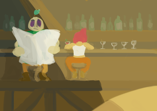
Been working on some colour scripts as well as colour palettes for the town. Tom P whipped up a few ways to colour the characters and we placed them on the background to see how it would work. We left out the character with solid black lines as he stood out too much, so just the one without lines (and a drop shadow) and the one with coloured lines was left.
However we're slightly torn between which one works best, that and the original colour palette for the town (the orange one) was causing the characters to blend in too much. After adjusting the colours a little, we ended up with this more pinkish reddish colour scheme.
So yeah, opinions on what works and what doesn't would be great!


Also some quick colourscripts to get a feel of things for each scene, still a fair few to do but they're really fun :)


I like the first one the best, but they're both really good... it'd probably be wise to just go with the fastest process 'cause it's pretty much win win.
ReplyDelete